Media Evaluation
Q1. In what ways does your media product use, develop or challenge forms and conventions of real media products?
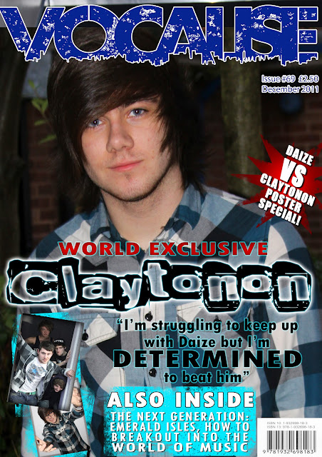
Like all magazines my cover follows the typical conventions, the Masthead is a main feature of my cover. The masthead is a vital part of the cover as it establishes the magazine for the reader, it gives the general idea of the genre of the magazine, I chose Vocalise as it is unmistakably linked to music letting the reader know what my magazine is about. My cover star is the main focus of the cover and of the magazine and so it is fitting for the image of him is to be on the cover, he depicts the style and feel of the audience I’ve targeted my magazine at. The image the simple and elegant, giving an impression of the artist without it being too busy and distracting. The information I included on my cover works effectively, it conforms to the typical conventions. I include incentives in the form of posters like most music magazines, incentives are a vital to sales of magazines drawing the reader in with the promise of free things. I also made my cover line a large feature of the cover so people know what is included in the magazine and decide whether they wish to purchase my product.
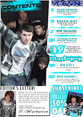
My contents page both conforms and challenges conventions related to contents pages. The main image on my contents page challenges conventions as I edited the images to give the impression of the band breaking out of the page, the front man then grips the page 19 graphic. This challenges conventions as it doesn’t fit the typical layout of a standard contents image. The layout is very confirmative having a list of my contents down one side, having a letter from the editor to build a relationship between the reader and the magazine making them want to buy the magazine more. I developed the idea of advertising a subscription typically they receive their own page for advertising but I included it in my contents page, this would instantly influence the reader into a subscription. I maintained a colour scheme throughout my entire contents page, a blue and white colour scheme was very simple and formal keeping a clean feel to the magazine.

The content of my double page spread has the typical conventions and uses them to address and inform the audience. The main image is used as the main focus of the page, I used a medium close up the get me of a detail picture of the artist face staring down the lens connecting with the audience, I used the image as the background so that it flows and creates a unity between the 2 pages. I added the sidebar for something that stands out against the rest, it was used as a way of giving the audience of small hits of information. I created a pull quote to follow the typical conventions of picking out important quotes for epenthesis, I chose to have the more important words larger and blue which draws the attention of the reader to these important details. The small text box for the Emerald Isles quote was kept separate as an added feature, its not going against typical conventions but its not used very often, I thought it would break the norm by having parts of the articles from other artists.
Q2. How does your media product represent particular social groups?
Many people are represented in my magazine, my magazine only stars males but different groups of people are represented. It represents artists in a positive way depicting them as sensible caring and creative people, they clearly feel passionately about their work, which is what they would want to come across in an article.
My magazine presents age a bit as all the artists and bands are young lads and the most creative people are younger where as the older people mentioned in my magazine are in positions of authority, producer and manager etc. This represents older generations as more powerful and have more authority where as the younger generations are far more creative and adventurous. There isn’t much reference to the fans except the talk about record sales, from the figures shown it shows that the fans are loyal and support these acts morally and through record sales.
I have dified the general stereotypes of rock fans, my representation is what most teenage rock fans actualy look and dress like so I feel like I've represented my audience in a way that they will relate to and understand.
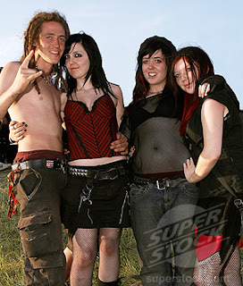
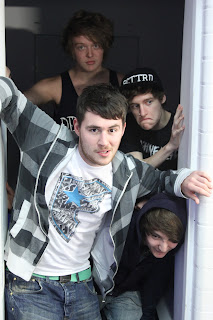
<-My Representation
Stereotypical Teen Rock Fan ->
Q3. What kind of media institution might distribute your media product and why?
Magazines are usually distributed by a company that distributed many, many different magazines. The kind of company I would expect to publish and distribute would be Great Magazines, they distribute some of the biggest selling magazines in Britain: Empire, Kerrang!, Q, FHM, Heat etc. They have experience developing and publishing music magazines making them perfect for my magazine, especially if my magazine is just starting out they would have the right knowledge do get the magazine up to scratch and earning a large annual turnover maybe even big enough to rival Kerrang!
When it comes to retail WHSmiths are one of the largest chains of newsagents in the country, the stock and sell all kinds of magazines and bookazines of all genres. The wide variety of music magazines available at WHSmiths means that there isn’t a gap in their market for another Rock magazine even though many people who buy rock magazines buy more than just one, meaning there is a chance to still get high sales. I would also expect for it to be sold in all newsagents and supermarket magazine stands etc. These sources bring in massive revenue as it’s an easy and quick way to buy a magazine during your shopping or on the way home.
Q4. Who would be the audience for your media product?
My magazine is aimed at a younger adult audience, 16 – 30 years, to attract this kind of audience you need to be formal and informative yet bold and fun. My magazine contains images and information aimed toward this age range, I depict the wide range of styles worn by people of this age. I chose the style of my models carefully to speak to the different groups of people who read this magazine, so people would relate to the things they see inside. Having said this I’ve tried to avoid using stereotypes so I wouldn’t offend or mislead the readers.
This is taken from the Kerrang! Media Kit it shows the target audience to be around the 22 year old range and how they have achieved the marketing to these readers.
This is the Typical reader of the Kerrang! magazine this is the kind of person i have trageted my my magazine at, they relate to the things in my magazine.
Q5. How did you attract/address your audience?
Lots of market research went into the design and content of my magazine, I found out who most of the audience are and what they want using interviews and questionnaires. I’ve studied how previous media texts have attracted audiences in and how they refer to the audience and portray that through their content. Kerrang! Attracts a very large audience so I took a lot of influence from their magazines hoping for the same success. Like all magazines i used incentives to attract people to buy my magazine, incentives are always used as free things always draw people to the product no matter what it is as the consume instantly assumes they are getting more value for money. I address my audience frequently throughout my article addressing their role on the music industry and the importance they have in the success of an artist. I try to attract consumes to purchase more copies of my magazine through a large advert for a subscriptionon myy contents page, hopfully people would see it and want to subscribe of a discount price.
Q6. What have you learnt about technologies from the process of constructing this product?
The main piece of technology I’ve used to create my magazine is Adobe Photoshop CS5 , I’ve not got too much experience with Photoshop so I’ve developed my skills with it a lot over this piece of coursework. I’ve learnt how to use this technology to manipulate and create images and graphics to build up an effective piece of work.
Quark was another new program I had to use, it’s very tricky software to get your head around but it’s extremely useful, I was able to create a shape around my stars body and around the text
already on my page, and then import my articles text into the interesting shape.
It was good to use such great equipment such and the Canon 500D Digital SLR, it gave great quality pictures and formed an amazing basis for my work. It’s an entirely new experience having this amazing technology to use and bring my thought to life.
The way I used Blogger to track my coursework was different to how I’ve previously submitted coursework, it was good to have a constant back up and log of my work and it’s very easy to organise my work.
Q7. Looking back at your preliminary task, what do you feel you have learnt in the progression from it to the full product?
My College Magazine was my preliminary task in which I created “Crashin’ in the Crescent” it was a small task that allowed me to develop my skills with Photoshop and to get the feel for creating a magazine. My preliminary task was a chance to test out all my ideas and to toy about with some of my more abstract ideas, I found out what works and what doesn’t.
Looking back at my preliminary work I can see that it is too simple and very amateur, I made lots of mistakes with tools and chose of content on it. I’m glad I did this preliminary task so I could recognise my mistakes and not make them again on my final work.
My final piece works well I think and is a great improvement on my preliminary task. The images are great quality and work well together, the text and font used look better and fit the genre of the magazine and the whole thing looks a lot more professional.
 My contents page both conforms and challenges conventions related to contents pages. The main image on my contents page challenges conventions as I edited the images to give the impression of the band breaking out of the page, the front man then grips the page 19 graphic. This challenges conventions as it doesn’t fit the typical layout of a standard contents image. The layout is very confirmative having a list of my contents down one side, having a letter from the editor to build a relationship between the reader and the magazine making them want to buy the magazine more. I developed the idea of advertising a subscription typically they receive their own page for advertising but I included it in my contents page, this would instantly influence the reader into a subscription. I maintained a colour scheme throughout my entire contents page, a blue and white colour scheme was very simple and formal keeping a clean feel to the magazine.
 The content of my double page spread has the typical conventions and uses them to address and inform the audience. The main image is used as the main focus of the page, I used a medium close up the get me of a detail picture of the artist face staring down the lens connecting with the audience, I used the image as the background so that it flows and creates a unity between the 2 pages. I added the sidebar for something that stands out against the rest, it was used as a way of giving the audience of small hits of information. I created a pull quote to follow the typical conventions of picking out important quotes for epenthesis, I chose to have the more important words larger and blue which draws the attention of the reader to these important details. The small text box for the Emerald Isles quote was kept separate as an added feature, its not going against typical conventions but its not used very often, I thought it would break the norm by having parts of the articles from other artists.